Here is my final movie opening submission
Tuesday, March 11, 2025
CCR 1
here is my creative critical reflection for question 1
Here is the link for my ccr 1 just incase the embed link does not work:
https://docs.google.com/presentation/d/11qG12G_plHWNrvmDD4u-9hTKySQ5pKlyQ_knA28hrb4/edit?usp=sharing
CCR 3
Here is my creative critical reflection for question 3
Here is a link to my CCR 3 just incase the embed link does not work:
https://www.canva.com/design/DAGha0yAmLw/s5bTYK290KhLLwkN6e2JEA/edit?utm_content=DAGha0yAmLw&utm_campaign=designshare&utm_medium=link2&utm_source=sharebutton
CCR 2
Here is my creative critical reflection for question 2
This is my link to ccr 2 just in case the embed dont work:
https://docs.google.com/presentation/d/1CQrBSZiMj8UQM9cYey6dAbKGdaghXabztPuLITPBk6w/edit?usp=sharing
SCREENTEST: AUDIENCE FEEDBACK
Screen Test: Audience Feedback
Me and my group created and distributed a questionnaire which aims to gather audience feedback, here is the blog.
The purpose of a screen test is to gain audience feedback about our work and see if their are any improvements that can be made. We decided to use Google Forms to create a survey to share without audience because, it is very easy and simple to both make and distribute our questionnaire to the potential audiences. Here are our questions:
1. What do you like about our film opening?
2. What improvement could be made?
3. Are these characters portrayed in a realistic manner considering their age bracket?
4. Considering this is an opening to a longer film, would you watch the rest of the movie?
5. Which of these potential title options would fit the movie best?
We chose these questions because we believe it would cover most of what we could and need to know in order to make substantial improvements and changes which would allow our film opening to better cater towards our intended demographic. We showed the clip to (3) members of our target audience to ensure that the feedback we receive is appropriate. Finding people for the screen test was easy, because our intended demographic isn't niche and is part of our existing friend group outside of our media class. Here is the draft that we showed audiences for the screen test:
Here are the results from the audience feedback:


- From the feedback I think we learnt that we did most things right, or atleast toleratble enough for people within our demographic to be able to accept it as a piece of media. The editing and effects within the opening was able to radiate a sense of grittiness and chaos, which might've helped the audience feel more immersed and interested, meaning this part of our film is good and we probably won't change much about it. We also managed to portray the characters pretty accurately based on their age bracket, according to the audinece of course, which also is good since we won't have to reshoot much or force and change how we act, I think acting according to the age bracket of teens is easy since we ourselves are teens, we won't change much about our acting except maybe refining it abit more.
- There are a few things that me and my group are gonna change. Originally me and my group wanted to call our film "Decent Boys", after much discussion though we decided that it was weird and wanted to change it, the audience research seemed to agree since no one chose that title, instead we might call it "Bildungsroman" as per the preference of our potential audience. The draft my group used unfortunately did not include audio yet, we are definitely going to change this.
- I believe that this screen test and audience feedback questionnaire was very useful because it helped me and my group decide on things that we were debating and unsure of. This included things like the title, which we spent most of our project lessons trying to decide through discussion and the use of AI, so it's just good to have something we could choose that the audience likes, or at least have a base on what the audience may like. It also helped us clarify whether or not our acting is good enough, based on how accurately we acted depending on our age bracket.
Self Reflection:
The audience feedback help give us an understanding of what our targeted audience want, thus giving us the confidence to remake and fix the problems that we have in our video.
Not much was received from the audience feedback however it gave us some comfort in knowing that we managed to get a few things done and get a rough idea on how we should continue with our project.
Typeface development, title and credits
Typeface Development, Title and Credits
This is a blog for our movies typface development, title and credits.
- Example that we like:
1. Fluroescent Adolescent
2. Teenage Dirtbag
3. Decent Men
4. Buldingsroman
- What credits/names will you include:
1. Actors: Sagara, Alex, Panji, Kenneth.
2. Director.
3. Production Company, Distributor Company.
-Typeface Exapmles:


Some of the chosen fonts display the text in grafiti form with excess ink dripping from the text itself, this enforces the fact that characters are improper, untidy, and in general displays their chaotic and immature nature.
After much consideration, we ended up with 2 promising choices.
Option 1
The first option sticks true with our preference with the grafitti aesthetic. We like it because it is not uniform in terms of the angle that each letters are presented in, it reflects the personalities of the characters as it is not formal and messy. The font also displays a degree of eccentrism, since it seems bold, bright, and thick, showing it in a way that makes it feel like it's in their face. The color used (black and white) also reflects the fact that our movie will also be displayed in black and white.
Option 2
The second options somewhat diverts from our prefrence of the grafitti aesthetic, instead it looks akin to a thick highlighter font. We like it because it is less bold, less formal, and more uniform in contrast to the first option, we think that the fact its less bold and formal means that they aren't brash and open as a group, instead they're simply a underground, small time group of misfits who simply wish to do their own thing.
We ended up choosing the second option because we believe that it is more toned down, as compared to the first one which I believe is a bit too much.
After careful deliberation, we as a group decided to branch out and try to find other options for our film name since we believe that "Decent Boys" sounds a bit off. Our options included; Fluroscent Adolesence, Teenage Dirtbag, Bildungsroman (German for Coming of Age), The List, Marked For Death. Eventually we agree on the name "Marked For Death".

- This is our final decision on the typeface.
Self Reflection:
Unfortunately we did not use any of the typeface Sagara originally researched since none of the typefaces fit the theme we are going for resulting in the typeface above. We also faced a few problem for the title like a clash of opinions on what the title should be, after long consideration we decided to go for marked for death since it fits our theme of revenge.
Post Production: Editing
This is my blog for Post-Production: Editing.
Everything here was done by Alex,
In the beginning the editing job was Arnolds duty where it took him a while until, our teacher got mad at us because we didn't show him anything for like 2+ months which was understandable but after that day Arnold sent the video which our teacher had some very strong words to describe our not so final work, such as "it doesn't make sense" and some others.
Our teacher gave us a lot of INVALUABLE feedback on this first draft of our video to improve because in his eyes was very lack luster for how long Arnold took to make it. Such as
- remove the filter on the title screen
- fix some of the audio
- make it make sense
- some scenes were awkwardly cut
- change the name of the movie
- quote in the beginning needs to change
- Remove the LIONSGATE part
--------------------------------------------------------------------------------------------------------
The first fix is I removed the LIONSGATE Title to save on time
--------------------------------------------------------------------------------------------------------
The second fix I implemented was to remove the filter Arnold put in the title sequence. Sagara also changed the quote to make it fit better to the film
 |
| Previous quote |
 |
| New Improved quote so summaries the messaging of our movie -------------------------------------------------------------------------------------------------------- The third fix is that I changed the title of the movie to make it sound better and fit the meaning of the movie better   -------------------------------------------------------------------------------------------------------- The next fix was to remove the flashing paint filter on the clip that Arnold did for the Regents media productions I did this by asking him for the original clip he recorded   |
--------------------------------------------------------------------------------------------------------
After all of that I finally got the fixes implemented and added some edits for some more intrigue
I personally was very surprised that we managed to finish this in the time that we did which wasn't a lot. Our teacher said it was a great improvement from the first draft that Arnold did.
some more feedback that was given
- Remove the strobe effect from the texts
- change the regents media productions to appear at the same time
- add more dialogue during the parking lot scene because it didn't have enough meat on its bones
- color grading needs more consistency
- louder voiceover
- make the movie title last longer at the end
--------------------------------------------------------------------------------------------------------
The first fix I did with the new feedback is to remove all the strobe effects from the titles, personally I thought they were a cool touch but the teacher said it looks "unprofessional and childish"

with the strobe

without

another example

without the strobe
--------------------------------------------------------------------------------------------------------
Another fix is that I needed to make the color grading consistent with the scenes where we are getting beaten up one by one, this fix was courtesy of panji one of our group members. I couldn't make it all normal without all the effects and stuff because Arnold our camera guy recorded the first beating up scene in the bathroom with the filter on so it's baked in the footage, so I can't get it to look normal

bathroom scene with baked in color grading

previous stairs scene, as you can see it's not similar as it's not blue
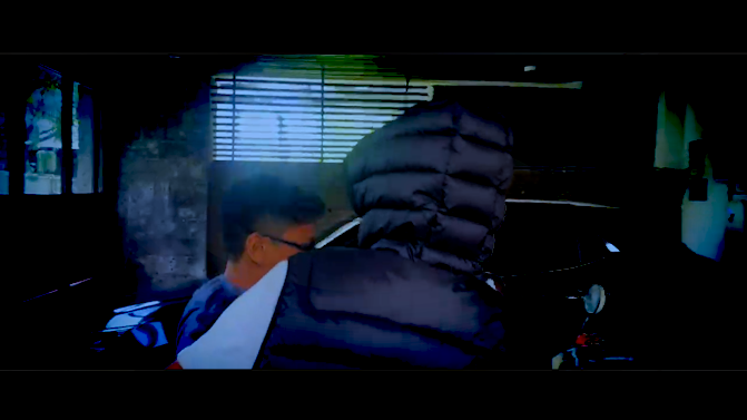
garage scene where I got beaten up. I tried to make it similar but since we recorded it during the APEX of day it's impossible to make it similar to the bathroom scene since it's way to bright with the sun. I tired to make it similar through the color grading but it became too blue quote "It's sour patch kids blue" -Sagara (one of our team member)

Improved version by Panji, it's more consistent with the color grading

It's less bright to more align with the bathroom scene, and it's a better blue
The final iteration of the video is within the FINAL VIDEO blogpost
Self Reflection:
I did the rough editing which did not go very well, after finally showing the teacher our result, the teacher gave us some criticism such as "it does not make any sense" so we had to reshoot a few more scenes and Alex put it all together which turns out to be somewhat decent.
Production: Organizing footage
This is My Blog for Organizing Our Footage
All work was done by Alex, kudos to him.
This is the programs and tactics I used to organize our footage

Google Drive
We used this program to send our clips, footage and voiceover to each other especially the editor
we also organized it into files to separate our footage from voiceover and to keep it all neat and tidy


-----------------------------------------------------------------------------------------------------------------------------

YOUTUBE / YOUTUBE STUDIO
I used this to also send video but I used Youtube to send edited videos when I was done editing to gauge feedback from my team members and teacher

I also used Youtubs playlist feature to further organize my edited videos

-----------------------------------------------------------------------------------------------------------------------------

I used File explorer to organized footage send my my team mates and myself


Self Reflection:
I helped with organizing the footage and giving a solid idea on how the editing should go, but Alex did most of the footage organizing by creating a drive where I can upload all the footages from my phone
Production: Behind the scenes
Production: Behind The Scenes
Here is the blog for my groups behind the scenes.
Everything here was done by Panji, kudos to him. (I took the pictures)
In this movie we had me as the actor (panji) and kenneth, maha, alex, sagara, as the side characters of this movie opening, we had some problems with choosing our locations and we wanted it to fit with the crime scene and so we picked taman bali festival and we figured that it added no value to our film opening naratives and our second location that we recorded was actually at school, we chose the kindergarten parking lot, and it turns our better and we had the vision of some scenes. we had some problems with continuation because in the parking lot there are some

in this picture we are trying to make an over the shoulder angle and make it following from panjis back, kenneth is positioned close to the stair so that he can run to the stair and it looks realistic.
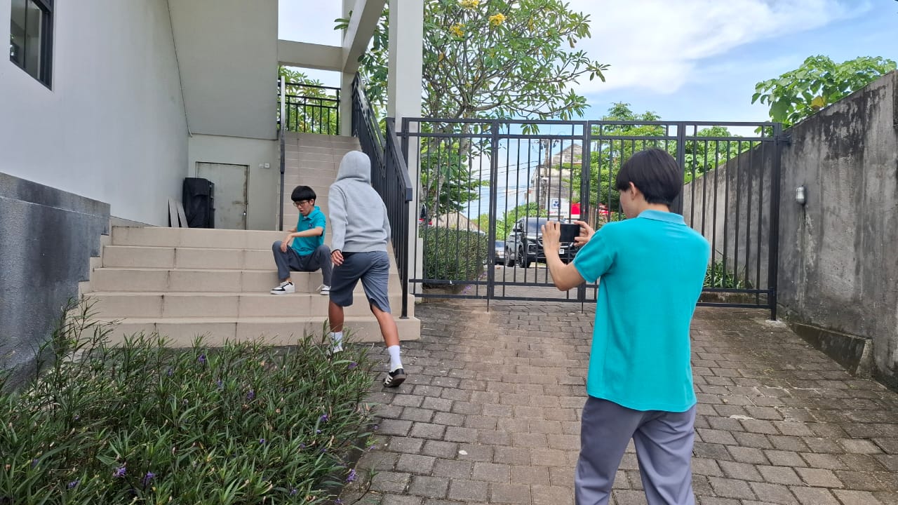
In this picture was a test scene or a practice scene, we do this to make sure the real scene looks perfect. we took around 3 tries and it didnt take that long because everyone understood the concept of this scene.
Self Reflection:
Unfortunately we had very little behind the scene pictures since we were so busy doing the actual thing and shooting, we did not really have anyone to take our behind the scene photos from the other scenes. I believe in the next project we could fix this problem by having one of our group member or someone else help us with the behind the scenes photo
Dominant Reading
Last week we learnt about dominant reading, here is a blog where me and my groups discuss our dominant reading. We did this as a group.
This is just a quick catch up session that we did as a group. We thought it would be a good idea to check what our intended dominant readings are for the different things being represented in our film opening. We have recently learned about Stuart Hall’s Reception Theory with Dominant, Oppositional, and Negotiated readings. For our media text to be successful, we want to make sure the message is clear and able to reach the correct audience. Below we will discuss our intended readings, and compare them to the intended readings we made in our Statement of Intent earlier on in the project. It will be interesting to see if our ideas have evolved.
How are these similar or different from your Statement of Intent?
The similarities are that our film opening still is entirely made up male teenage actors, this also means that our intended demographic and psychographic stills stays the same as our statement of intent. The characters in the movie are still portrayed as rebellious delinquents, who act in a gang though it pretty much is entirely a social group gang, they still act and are portrayed as delinquents and somewhat negatively, though things like their faces, hair and outfit probably don’t reflect it all too well. The film opening will also still contain an inner monologue as we stated previously, and will pretty much serve as the main source of characters speaking. We also still used the same location (taman bali festival and cosmic diner) as it still fits best with our desired genre and vibe.
Aside from that, the film's opening is almost entirely different. The activity that the gang and the members are doing is different, in the statement of intent we stated that they’d rob adults and unsuspecting people and hang around in alleyways, in our actual shooting the actors are pretty much just hanging around as a group, vandalizing an abandoned place which may not be considered a crime, and carrying a singular knife. The general synopsis of our film opening has also changed, originally it was meant to be placed in a civilized town with action and actual serious crimes being committed, but the film opening we shot does not include any of that, the opening also doesn’t really show any sorts of reflection or regret, rather that the character is embracing it, and seeing it simply as a social friend group. We did not include an adult. The dominant reading we originally had which originally was supposed to deter kids from join gangs, if anything the film opening we had might encourage them as they look cool and chill, though the setting they’re in might still make them have second guesses.
Self Reflection:
Our film went through so much revisions and reshoots, after multiple feedbacks and criticism, we created something else entirely different so much so that the dominant reading changed entirely, however even with that happening, the dominant reading gave us some reassurance and a solid idea on what to make to match it as close as possible to the old dominant reading.
Subscribe to:
Comments (Atom)
Critical reflection
Intriduction: for my comp 3 our group was told to do a music promotion package to use the song Chambers Of Reflection by Your Anxiety Buddy...

-
This is my Pre Production Genre Research Copy of Genre Research - Music Video by Jeremy Arnold I learned a lot from doing this res...
-
This is the Location Scout & Risk assessment done by me
-
 This is the thumbnail research done by me The thumbnail above is half an image of a child in black and white and half an image of a grown ...